The pROJECT:
The IHG Customer Care experience was the last bit of IHG.com that was still not responsive. The ask was to redesign pages for Customer Care Home, FAQs, Phone Numbers and Forms, without changing functionality.
My team was brought in the do a lift and shift, and we ended up doing so much more. We reinvigorated the home page, made the forms dynamic, organized phone numbers by region and created a smarter quick reference section, and gave the FAQs a facelift.
MY ROLE:
UX Architect & Strategist
DATE:
Launched March 2019
MEDIUM:
Responsive Web
THE APPROACH: DYNAMIC FORMS
Before we started I had the opportunity to do some concept work on IHG's Virtual Assistant. Though I wasn't officially on the project, I had a friend who told me what they were working on. I did some research and approached the team with my ideas, and they let me unofficially join in and incorporated my ideas. Our customer care experience isn't easy to find, making it harder for users to get their issues addressed. Because of this I recommended we take more holistic approach, incorporating all customer care options (FAQs, phone numbers, forms, and live chat) into one smart bot experience that could be easily accessed from any page of the website.
At some point the separate Customer Care project spun up, and I took my ideas and learnings to my team. We talked to vendors to figure out what we could do, and even considered working with one to create a proof of concept. There were several meetings with leadership to determine if we would be able to move forward. Unfortunately it wasn't possible at the time.
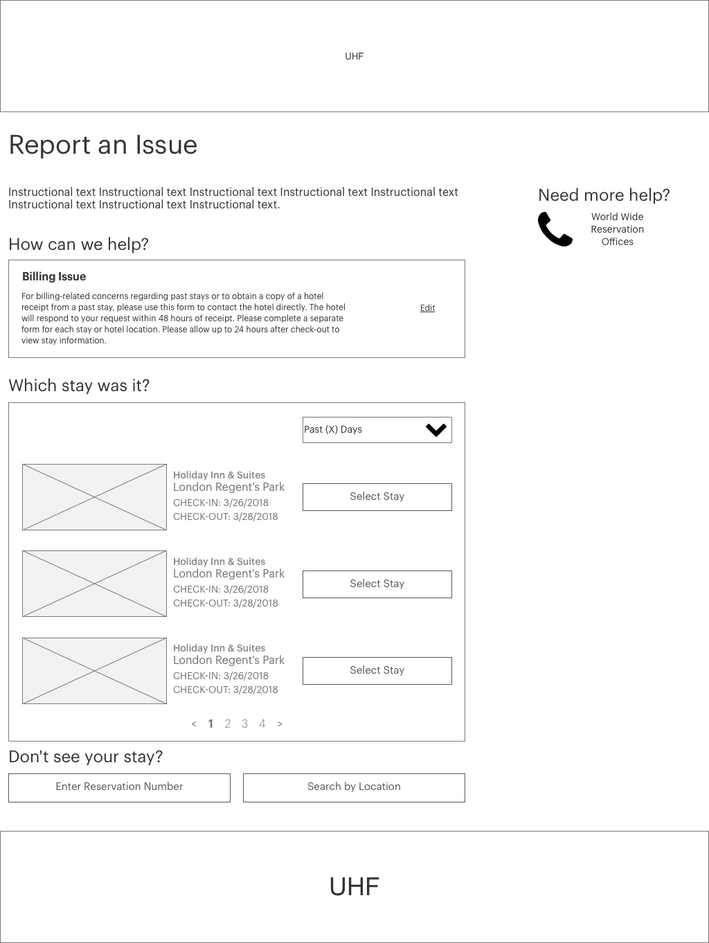
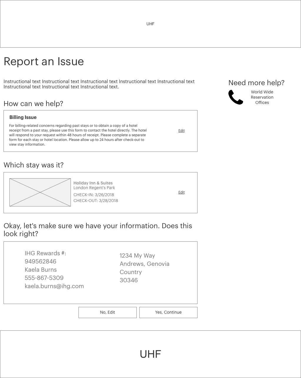
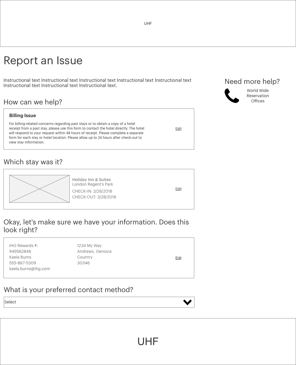
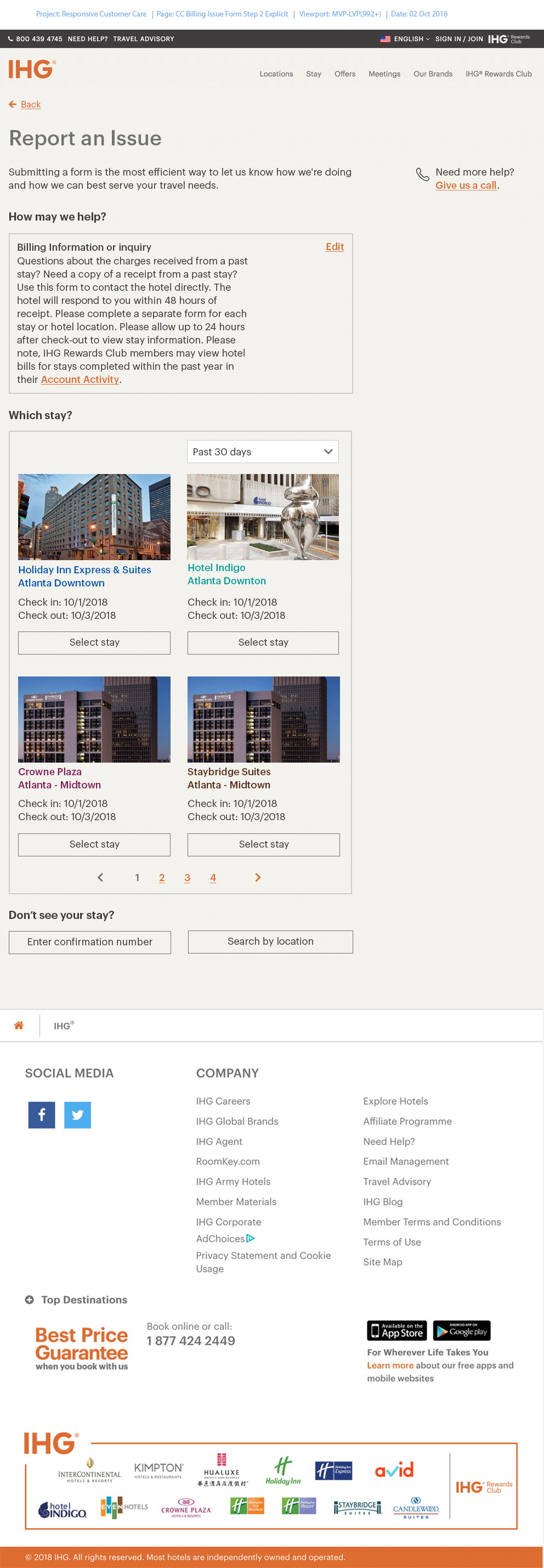
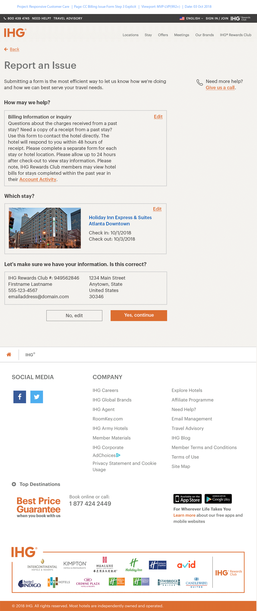
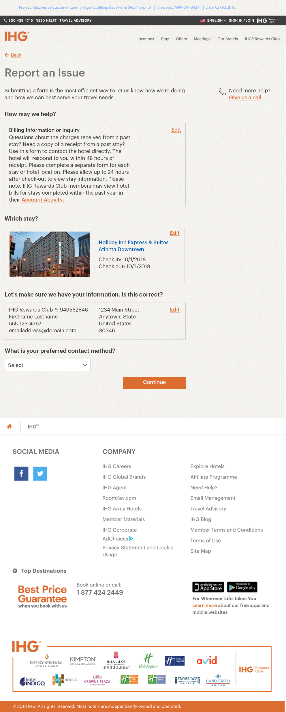
Though we weren't able to implement the concept, I took my learning from that when approaching the forms. Traditional forms present lots of open fields all at once, which can be intimidating for users. After creating the holistic concept and thinking through that perspective, I recommended creating a more dynamic experience, and that's what we did. Users answer one question at a time, and are only presented with information essential to their task. As each field is submitted, the piece collapses into a preview state, and the next field appears. By the end the user has a quick, clean preview of the information to review before they submit. The tone of the copy was also changed to be more conversational. We wanted users to feel they were truly being taken care of, rather than simply submitting a cold form.
Dynamic Forms Wireframe Samples



Dynamic Forms Design Samples



THE Result:
Home Page
The previous home page experience was a lot of content presented at once, with no real welcome. When users get to this page they are often already somewhat bothered because they're coming solve a problem. As a hospitality company, it's important that we extend a warm welcome to our guests, especially if they need our assistance. For this reason, we added welcoming photography, added a quick search to help people find info faster, made the CTAs more obvious, and collapsed content areas to lessen the cognitive load.
Phone NumbersPreviously, users had to scroll through phone numbers listed by country, with a layout that hurt eye tracking. There was also a quick reference section of numbers at the top of the page which always displayed the same info regardless of user location. Users on the other side of the world would always see US & UK numbers first and had to scroll through the rest to find their own, creating further frustration. I organized the phone numbers by region, and made sure the quick reference numbers change based on user location, to ensure that they get the most relevant information first.
FAQs
The FAQs were previously all open on load, creating a heavy cognitive load with a lot of text and no breaks. Additionally, users had to scroll through all the categories to find what they needed. We collapsed the categories to allow users to scan through and find content faster.
This file includes:
SPA: Flows for site & forms
AEM: Home, phone numbers, & FAQs


