The PROJECT:
IHG has been charging through a growth period, and one of our primary focuses is our Luxury Halo. Among our top tier hotels is the InterContinental Hotels brand, which has a website that hasn't been updated in several years. The product strategist over IHG hotel details pages approached the Testing and Optimization (TAO) team to see if we could create a modest redesign to get some quick insights into how to improve their hotel details experience.
We had a strategy session with brand, data, product, and UX to identify where we would focus. As a team we decided on 3 main objectives: Get the location name above the fold, fix navigation issues, and restructure the content on the page.
MY ROLE:
Lead UX Architect
DATE:
Q1 2020
MEDIUM:
Responsive Web
THE APPROACH:
The first step on this project was diving into research. For each strategy session on TAO, we bring different disciplines together to create a thoughtful strategic approach. I always lead the UX charge with competitive/comparative research and a quick heuristic analysis. This assignment also called for me to utilize my relationships with colleagues working on other luxury projects, and I was able to get some insight and wisdom on how to approach the InterContinental brand. After that I put together a presentation and shared our perspective with the greater team.
Once we had our goals we moved forward quickly. Our first two objectives were fairly straightforward, but restructuring content was a lot more open. To understand what would be most impactful I had to do more research. Without the ability or time to talk users, I turned to our other luxury brands for inspiration. Because of my relationship-building efforts I was included in the results and readout of a card sort done on the Regent hotels website. This played a heavy influence in how I restructured the content and reordered the page.
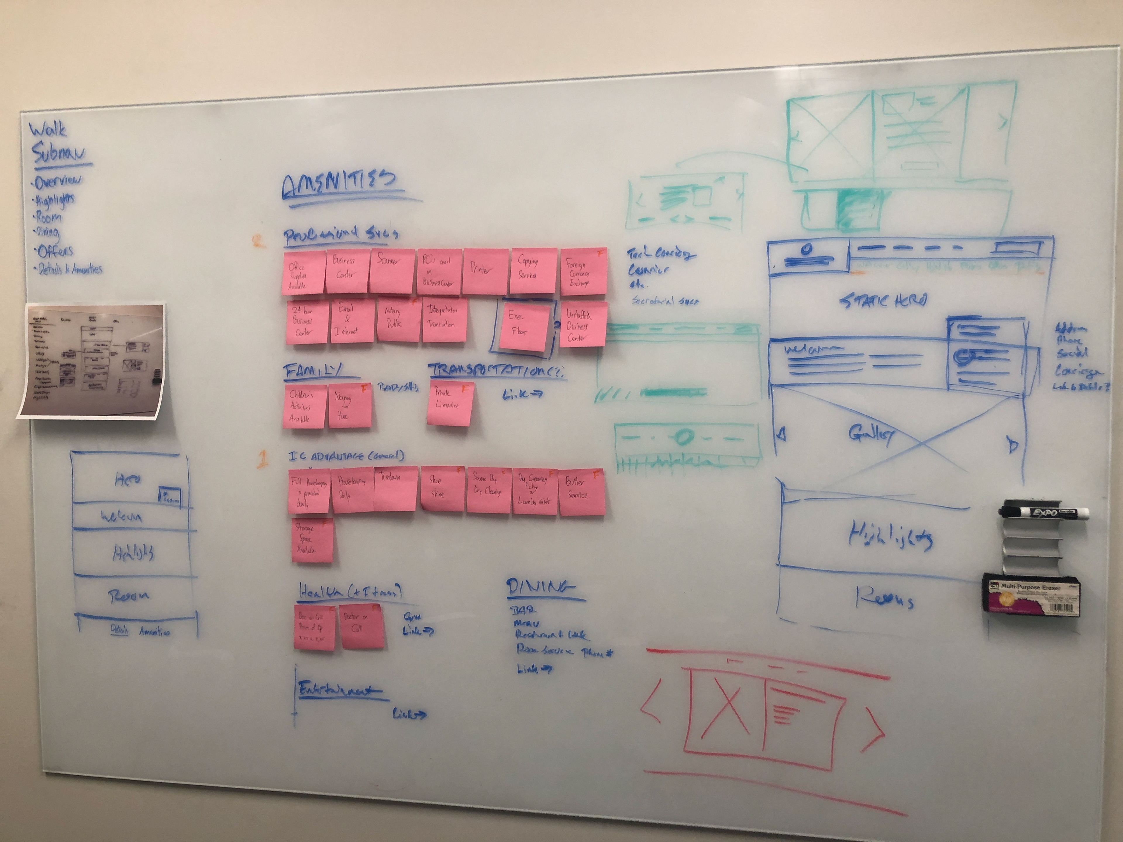
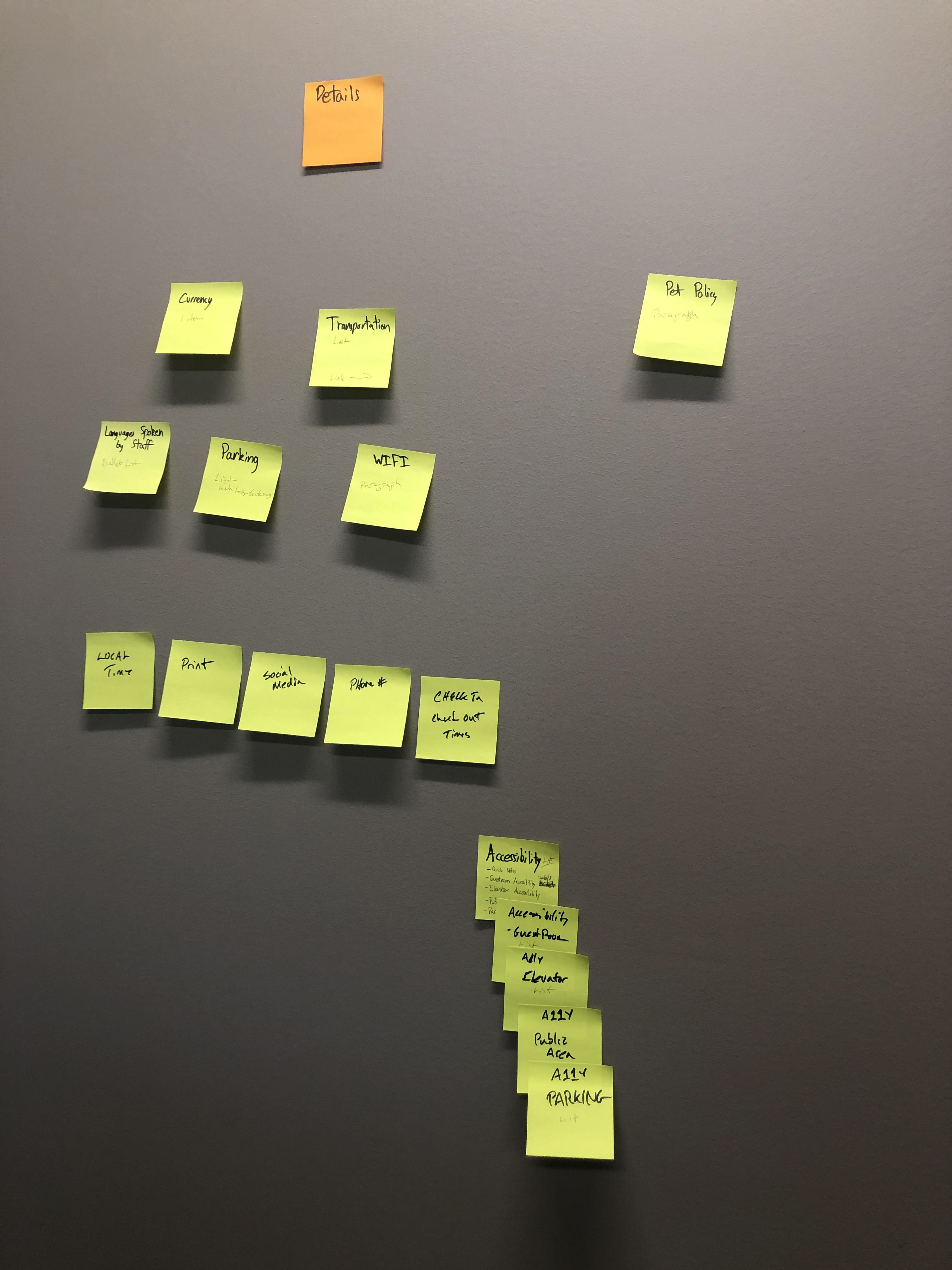
When looking at the hotel details/amenities and services I noticed several repeated values, and a lack of clear categories. The two sections were far from each other on the page, and neither was open on load. A user had to click up to 3 times to uncover the content. We know that the way to sell luxury users is to give them the details and show the value of the experience; with all those selling points hidden we were doing our users a disservice. In an effort to explore how we could improve this section, I facilitated an affinity mapping exercise with another UX architect and visual designer. We collaborated and talked through each section, and in the end we realized we wouldn't be able to make major changes to the categories without doing more in depth research. While we were unable to do this for our test, I recommended to the brand representative that they invest in a content test with users, which they did independently soon after.
THE CoNCEPT:
After doing some competitive/comparative research, digesting the Regent card sort, working with our product owner and development lead to assess constraints, my team and I worked through some concepts.
We solved for our first two goals. First, on the current experience the hotel name and location are not visible on load. The oversized hero gallery pushes that content below the fold. I proposed adding an overlay at the bottom of the hero, and pulling the hotel name up so it's visible immediately. This gives users much needed context on load, so there's no question to what hotel they are viewing. Second, the navigation on the current site gets taken over by the secondary jump nav as soon as users scroll past the welcome message. This leaves users with no way to navigate through the other pages of the website unless they scroll back to the top of the page, only allowing them to jump from section to section. To solve this we stacked the jump nav under the primary nav, so as users scroll they consistently have full access to all navigation options.
The "walk" version on the left below shows the least changes, and the easiest development lift. Here I focused on making location information more apparent, and pulling the details and services into one section which would be anchored in a jump nav link.
On the right we have a "run" version. Here we considered making more substantial changes, completely restructuring each section to pull content out of currently buried sections. The aim of pulling content out rather than hiding it behind drawers or truncated sections is to remove obstacles from user goals. The assumption being that users come to the site to research the destination, I wanted to make sure as much content as possible was available with as little work as possible.
Due to timing constraints we ended up going with the "walk" option. However, the brand team continued to consult me in their working sessions and research strategies.
Conceptual Wireframes


